top of page
Programs used:
InVision, Adobe Photoshop/Illustrator/AE, Unity

New Card Feature
New limited-time mode to add diversity and excitement to the game

problem:
-
Stakeholders wanted to add a completely different kind of user experience to the application. The design of this new user experience needed to be intuitive while interacting seamlessly with the core flow.
pain points:
-
Since our user base was composed of women, ~76% which were in the age range of 45 - 60 there was difficulty adding new features that could be perceived as too complicate
hypothesis:
To add a new feature based on popular card collection systems. This would increase metrics while also providing a feature that could visually change with the seasons.
research phase insights:
-
Other applications in the company who had also seen a decline in revenue had seen an increase when they modernized the feel of their UI.
-
Recent analysts showed our user base was composed of 82% women, 76% in the age range of 45 - 60. We needed to keep the design acessable for that age group.
brainstorming:
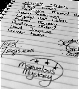

-
Feature name needed to be decided on.
-
Rough logo sketches.
-
I also put together a mood board for the feature visuals.
auditing established products:
-
Using the top, established applications already in the card collection space I based wireframe layouts in ways that reflected the established user experience.
The Elder Scrolls: Legends
-
I used, and collected personal data for a week playing these applications to help give insight to my wireframes before presenting them to the team.
Shards of Infinity
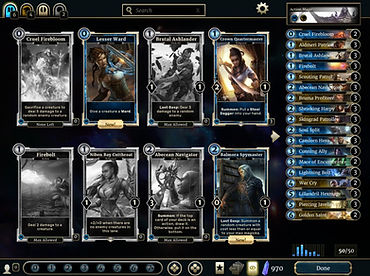
wireframes:


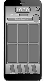

final wireframe for deck-board
flow charts:
I started the flow charts with post it note iteration, and white board drawings. Through critique and iteration a final flow chart was approved and I moved onto wireframes.


finalized flow chart

wireframes:
WIth the main deak board design decided on, I moved on to gray boxing the rest of the flow chart. As art started to come in I would replace visuals till we had a clear step by step prototype.


This is an example of a document I made for more developer required aspects of the design. Writing out the user experience helped to reduce any chance of miscommunication. These were always reviewed by the stakeholders to ensure things were still in line with the acceptance criteria.
.jpg)
internal testing:
For this feature there was a round of internal testing within the company. Leveraging the teams beyond our own QA we hoped to release a better product
internal testing insights:
-
Gathering the results we found the instructions were somewhat confusing. To remedy this we decided to revisit the design of the FTUE (first-time user experience).
-
We also added some more accessibility through some slight resizing of assets as well as adding more animations to clickable items.
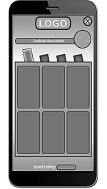
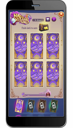
For the FTUE we added an additional page to clarify how the duplicate card collection worked.
B.png)
Final Release


results:
Launch of the feature went overall smoothly. However launch was delayed due to some unexpected edge cases found at the end by our quality assurance team. During the first limited time run of the feature we saw a huge jump in the application monetization by ~6%
conclusion:
Adding the card collection feature was launched to many users satisfaction. However during the second and third time limit run of the feature a few areas of user friction were starting to become apparent through user interviews. A version 2 of the feature was scheduled to happen at a later date.
bottom of page