
UI Overhaul
Our DAU was an area where we could improve the games performance. This system was developed to boost that number up

Programs used:
Adobe Photoshop/XD/Illustrator/AE, Unity
problem:
-
With the application reaching its 3rd year of release, it was losing revenue, unable to retain existing users, and not attracting new users. The team wanted to stop the decline and and increase user retention and acquisition by 5%.
pain points:
-
As the application aged, there was a slow .03% on average weekly decrease in daily revenue.
-
As more features had been added to the application, visual clutter had emerged and it was harder to surface new data to our users.
hypothesis:
To appeal to and gain new users, while retaining loyalty and confidence of long-time users, a refresh of the UI and visual assets was needed.
research phase insights:
-
Other applications in the company that had also seen a decline in revenue had seen a subsequent increase when they modernized the feel of their UI.
-
Recent analysts showed our user base was composed of 82% women, 76% in the age range of 45 - 60.
-
The product manager on the team decided to test the redesign on a key monetizing feature to get better quantifiable data.

Redesign Decisions
-
Remove the characters, they were simply adding visual clutter without purpose.
-
Move the header to the top of the page for a clearer progression flow for the user.
-
Simplify the text for quicker understanding.
-
Increase screen contrast for easier legibility.
-
Keep monetization features in the same location for user accessibility.
as is
After gathering research and developing a strategic plan, I made a variety of wireframes. After many iterations, the team decided on a new design, which we quickly launched.


final redesign
results:
When the redesign was deployed, the application quickly reflected a decline in sales. We took immediate action, reverting the update and conducting user interviews to discover the reason for the decline. We uncovered that the experience was disconcerting. The rollback leads to sales returning to normal numbers.
research . . . . again:
-
I focused on in-depth audits of similar products, in tandem with data gathered from other internal applications.
-
During user interviews and surveys, the feedback was they liked the new UI, but they didn't want the existing one to change

Research Findings Part 2
-
Need to implement new modernized UI using a different strategy.
-
Auditing other products revealed we had added visual clutter with too many internal frames. Many simply darkened the screen while free-floating the information.
-
Strong data from other added features demonstrated that long-time users stopped using a feature after a visual update, even though all the assets were the same.
hypothesis:
To prevent the previous miscalculation, the team decided to apply the new solution of free-floating more items to new features, while doing smaller design changes to core application designs. As users adapted to the newer designs we would again attempt to update those screens.


-
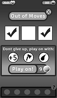
Kept Old UI
-
Removed some buttons and simplified copy
-
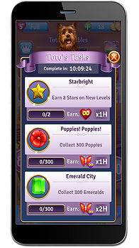
New UI
-
Removed duplicated framing elements around award
-
Strategically used remaining framing elements to enforce text hirearchy
-
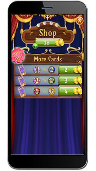
New UI
-
Another pass of removing doubled up framing elements

Sample Audit App: Candy Crush Friends
-
New UI
-
Biggest feature visual update
-
Focused on the ranked UI to be cleaner to help encourage retention
-
Adjusted old UI
-
This design fit the style update still
-
Updated button types
-
Enhanced animations