Where One UI 7 missed in an overall great update
- Kamryn Seidl
- Apr 24, 2025
- 2 min read
Updated: Jul 22, 2025
Images taken from Mr Android FHD The update was rather large this round, and while I try and keep my thoughts on complex systems as, phone UX limited, there are 2 missteps I want to address. The search flow and the flashlight location. The issue with the flashlight is that I would have preferred to have the info on that particular part of the update forced on me. My phone auto-updated in the middle of the night, as is my preference. That same night, my black cat decided to make a jail break and busted out of the cracked open window, through the screen, and into the misty forest. I threw on my robe and
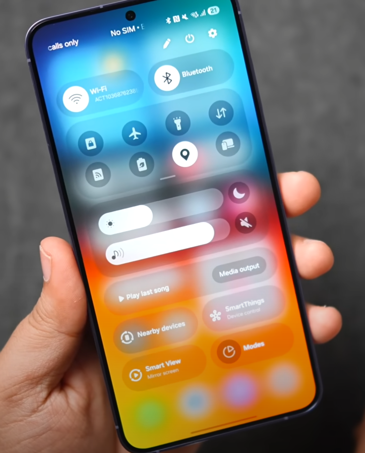
slippers and ran outside to catch her. I flipped open my phone and fell further into my panic when I couldn't find my flashlight. I couldn't even find the quick settings menu. Frantically sliding my finger down the screen, all I kept getting were my notifications, which only increased my panic as I wandered outside in the drizzling rain, looking for my escape artist. Of course, a quick Google search revealed why it had changed, and I do love the customization. However, it seems irresponsible for developers to leave features commonly used in emergencies without providing a more forceful warning to the user of them, either before implementation or after.
In my opinion, such important and quick access feature changes warrant a disruption to my user flow. I hate pop up tutorials like most people I've surveyed, however when it comes to features that are often used in emergencies I think its worth the friction of forcing a user to at least open the update details menu before accepting the update, simply due to that many will just quick click through without reading it, that is until we run into an issue later. The other big change I felt was a miss is the update to the quick search feature. I get moving the input bar to the bottom of the screen, right above where the keyboard sits. However, I don't think it fixed what I assume was the goal of the change. When the search bar was at the top you would have to tap it to activate the keyboard and then move your hands back to the bottom of the phone. However, by keeping all the search results at the top of the screen, I still need to readjust my hands to select the item I searched for. I wish they had kept the old flow but moved the whole unit down to help speed up reaction time and reduce the redundant hand movements. It was a great idea that only shed light on the features flow rather than addressing it IMO.


Comments