Questing Refactoring and Redesign
Unified the look and informative data to reduce tech debt and player frustration


Old
New
Objective
Streamline the questing system between daily, weekly, and patch related tasks.
My Role
Research
System Design
Stakeholder Pitches
Product Management
Dynamic Prototyping
Illustration
Unreal Implementation
Tools
Figma
Illustrator
Photoshop
Blender
Unreal Engine
Team
Myself
UI Programmer
Duration
Started Sept 2023
Launched Jan 2024
The Challenge
Balancing Game Design's need for a complex information distribution hub that followed good UX design principals
Over the years the daily quest feature had greatly reduced in participation while the newer weekly released quests had much higher interaction. By combining the two we hoped to increase DAU and reduce tech debt on the back.
The timing of this presented another challenge. We were down developers and this task came with tool implementation to automate quest creation. Design needed this ASAP even though I was deep in the store redesign which launched the same patch.
Confusion
Many new users were unaware we even had a daily questing system

Dev Limitations
Team reduction required us to make the quests more automated.


Inflexibility
8 weeks of data, with 3 groups of 3 tasks per reward was a lot to put on screen. I wanted to avoid an overwhelming scroll of data
Result
User interactions with the whole system increased 3.5%. Surveys also provided feedback that players found the new system easier to understand with a 4.1/5 rating
The Solution
The solution came by using my design sense alongside my creative background. With animation I was able to disguise a tech limitations. Solutions don't always come from one place and having a team of diverse background really made this come together

research phase insights:
-
We set out a survey to see why those who constantly did their daily quests did not interact with the longer Trials system. Thru those we confirmed that this was mostly due to the paint points of 1: knowing what trial they could do once they entered a round, 2: how far they had progressed on that trial, and 3: Really disliking character based asks
-
In these studies we also discovered that most didn't even look at their daily quests, they were just normally completed while progressing the Trials. This reiterated that those who simply seemed to just be doing daily quests were probably also not looking to see what they were during a session
Research and Prototyping
Identifying pain points
Our Community manager and me sent out a survey focused on players quest interactions. Thru those we confirmed that lack of interaction was mostly due to friction when interacting with the system.
In these studies we also discovered that most didn't even look at their daily quests, they were just completed thru normal gameplay.
Knowing what trial they could do once they entered a match
1
Lack of clarity of how far they had progressed on that quest
2
Collecting rewards was not automatic once completing a quest
3
Implementation and Testing:
-
With only 1 designer (me) and 1 developer on the task we had to be transparent and communication. Communication and visibility were critical because many of my visual designs were completely out of scope technically.
-
We also decided at this point to use tech from one of the existing systems to help expedite our goals. But to do that we had to be clear with stakeholders it would not be saving any development time. The scope was still within our given time, but by using old tech in one area we had to update it into an area of the product that had never had it.

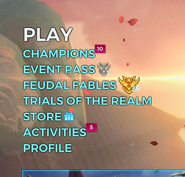
Daily Quests
Trials
Lore
-
We started by using our standard pagation to reorganize the 2 systems together
-
Thru testing I was also able to confirm my hunch that the use of 2 different names were proving confusing to players. So I put Daily Quests under the Trials page, however on the popup that tracked both systems I renamed it "Activities" which would be a hub to keep track of all a players progress in one place.
However this came with a large hurdle that me and my developer had to figure out thru many personal talks. What would be a good UX solution was impossible to do in our timeframe, and what the programmer could come up with was not good UX.
-
Tooltips ended up being the answer. With the extra room animating a tooltip provided me within the limited space, I was able to get all the data info in that the game designers wanted. If at a short character count. (they were warned!)
-
With this solution, we could simply add an animation trigger and it would make it look like the tech was doing way more than it actually was under the surface.

results:
After the new feature was activated there was a 70% decrease of tracked Game Developer and QA time, as well as an ~3% increase of user logins over the next 2 weeks.
conclusion:
After the post mortem meeting, we felt very good at how the reception had gone. Overall it was a success and provided the goal of reducing tech debt. Personally I was also greatful for a second chance to improve the UI of the original to feel more true to the game while updated to current cleaner trends.